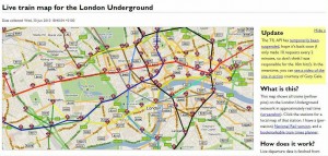
Two weeks ago I got excited that you can now plot the progress of trains on the London Underground. Unfortunatley so popular was this service that the Transport for London server providing the data has ground to a halt. I’d like to think it was because of the publicity it they received from trefor.net but I doubt that was the case.
This morning twitter is slow as a tortoise, at least from platforms such as tweetdeck that rely on using the twitter API. This is just as organisations are learning how to use the service to their advantage. For example I retweeted a National Rail tweet this morning in the hope of winning £90 worth of Oyster Card top up.
Clearly new and innovative products and services do have their teething problems but this does go to show how quickly we are becoming (have become?) slaves to technology.
I’ve pasted a screenshot of the underground tube map with train locations – showing no trains. The link to what it should look like is here – or at least what it looked like when it was working. Link to traintimes.org.uk site here. Click on the screenshot below to enlarge it. More spiel from Grauniad here.

