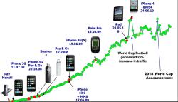
 This chart is a few months old now but I haven’t had it all that long and is still interesting to take a look at (click either pic to enlarge).
It shows the growth in O2 3G data traffic between 2008 and 2011. See the spike when the iPad was introduced combined with the football world cup traffic (dunno why anyone bothers!).
I don’t have an up to date one which would probably be even more interesting but I suspect that is too close for commercial comfort.
Over the next few weeks I’m going to be covering two main themes. These are the Olympics Games and 4G. They are different though to some extent the technical aspects are very similar. Both subjects are going to be in our consciousness quite considerably from here on.
I’m not going to be blogging or tweeting over the Easter Holidays so see you all back on the 16th April, thoroughly refreshed and ready for the sensory onslaught that will be the run-in to London2012.
PS Thanks to O2 for the chart – keep the info coming guys – everyone is interested 🙂

One reply on “Growth in traffic over O2 3G data network between 2008 and 2011”
Someone has quite rightly pointed out that the Y axis of the chart doesn’t make total sense. I think there is some truth in this but I’m going to leave it as is partly because I’m off on holiday soon and partly because the chart does at least show the trend.