I have occasionally written posts concerning the rise in internet traffic when there have been major world events. Of course this included last week’s Wimbledon antics.
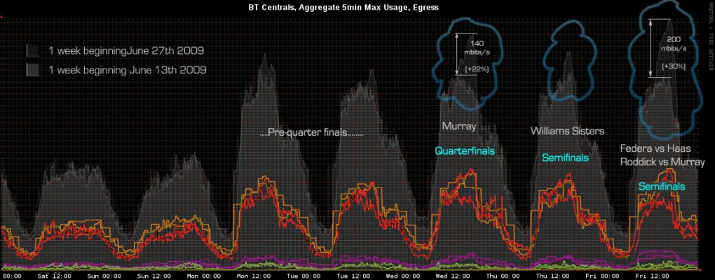
I thought it would be interesting for people to see an overlay in broadband network traffic week on week to see what a “normal” week would look like compared to a high traffic week.
The chart below shows last week’s Wimbledon peak traffic profile in the slightly lighter grey compared with the previous week’s.
It’s a bit dark but if you click on the image a couple of times you should get a large enough view to see that when “our Andy” took to the court on Friday the traffic shot up by 30% compared to the same time last week.
The purple line at the botton represents an old low capacity 155Mbps BT Central pipe that is being decommissioned next month. These older pipes struggle to cope with high network demand. The 155 is being replaced with more 622 capacity.

